
.svg)
DeepSift
AI Image Detector
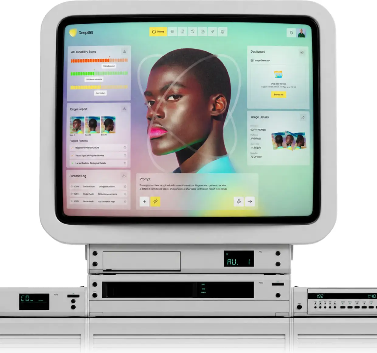
DeepSift tells you in seconds whether a photo is human or AI. Taqwah designed it all from scratch: identity, web app, landing page, and mobile, as one connected system.
The Project,
At a Glance
Ready-to-build product, covering research, UX, brand identity, and mobile design.
.png)
.png)
Someone on Our Team
Was Harassed With a Fake AI Image
We looked for a simple tool to prove the image was fake. Nothing worked well
- Existing detectors were built for researchers, not everyday people
- Most tools showed confusing accuracy scores with no clear answer
- Uploading a personal photo to unknown platforms felt unsafe
- The people most affected by fake AI images had the least access to reliable tools
%20(3).png)
%20(4).png)
Brand Identity Design
for DeepSift
Most AI detection tools look like lab software. DeepSift needed to feel like a friend, not a forensic system. A calm palette and clear typography make the product feel safe in the moments people need it most.
.png)
%20(1).png)
%20(2).png)
AI Detection,
Fast, Clear, and Safe
Recording had to feel effortless. The AI summary had to earn trust. And the path from "I recorded something" to " have a proposal ready" had to feel natural, not like extra work.
One Clear Verdict
Users needed a plain human or AI answer, not a percentage score they had to decode.
Built for Non-Experts
The interface had to work for a parent, a student, or a journalist. Not just engineers.
Safe to Upload
People upload sensitive images. Privacy had to feel obvious, not buried in a policy page.
Verdict First, Then Trust,
Then Everywhere
The user needed a clear answer before anything else. Every decision came after that: the calm brand identity, the safe upload flow, and the mobile experience. Answer the person, then build the trust around it, then take it everywhere they need it.
.png)
.png)
.png)
Mobile App Design for
Checking Images on the Go
Most suspicious images arrive on a phone. The mobile experience keeps the same one-tap upload, clear verdict, and safe flow, designed for checking images the moment they land in your inbox or DMs.
.png)
.png)
.png)
.png)
AI Image Detector
Web App UI Design
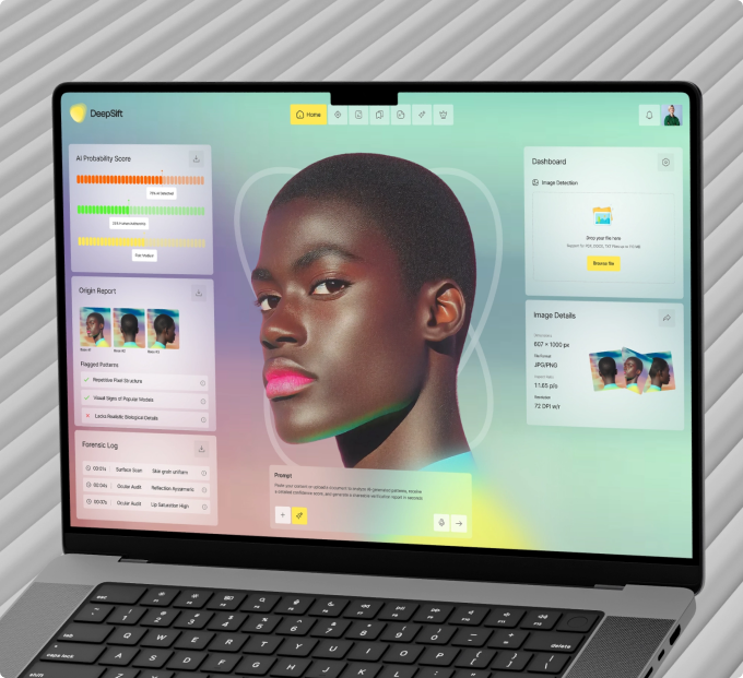
The core product. Upload a photo, get a verdict in seconds. Every screen removes friction: a drag-and-drop upload, a live analysis state, and a result page that says human or AI in plain language before showing the technical detail.
.png)
.png)
.png)
The UX Decisions
Behind the Product

Non-experts don't know what 87% means. A clear verdict removes the guesswork and gives people what they came for.
You book a free audit or a strategy call. We look at your product or idea within 48 hours and tell you exactly what's broken and what to fix first. If it makes sense to work together, we agree on what gets designed, what the result should be, and when you'll see it. No payment before you've seen our thinking.
You book a free audit or a strategy call. We look at your product or idea within 48 hours and tell you exactly what's broken and what to fix first. If it makes sense to work together, we agree on what gets designed, what the result should be, and when you'll see it. No payment before you've seen our thinking.
From Personal Problem
to Public Tool
Typing felt slow. Recording felt easier, but recordings piled up unused. Nobody wanted to record, then transcribe, then edit, just to get one clean paragraph.
Start With the Real Scenario Body
A person receives a suspicious image and needs an answer fast. Every flow began here.
Simplify the Verdict Body
We replaced accuracy percentages with a plain human or AI result. Technical detail lives one tap deeper.
Build the Brand for Trust Body
Warm colors, clear language, no lab aesthetic. The identity signals safety, not surveillance.
Landing Page That Moves
Doubt to Answer
The landing page had one job: get someone who just received a suspicious image to upload it and check. Clear messaging, real examples, and a conversion flow built to turn worry into action in one click.
.png)
.png)
AI Voice-to-Text Product Ready to Build
+50%
Most users sign up and never come back. Not because your product is bad because the first experience is confusing. When we fix how users get started, more of them reach the moment where your product actually clicks. That's when they stay.
2.3%→5.1%
More visitors signing up without spending more on ads. When your website clearly explains what your product does and makes it easy to get started, the same traffic converts at more than double the rate.
3x Faster
Every screen delivered with specs, component documentation, and responsive breakpoints. Your developers build exactly what was designed. No back and forth. No guessing.
-40%
When a product is easy to use, people don't need help using it. Fewer "how do I do this?" messages. Less time your team spends answering the same questions. More time building what actually matters.


.png)
.avif)












.svg)
%201.svg)
